


services
copywriting
graphic design
art direction
public relations
photo imaging
direct mail
POP | POS marketing
web consulting
portfolios
design @ behance
photography

Bad Design—Who Pays? Everyone
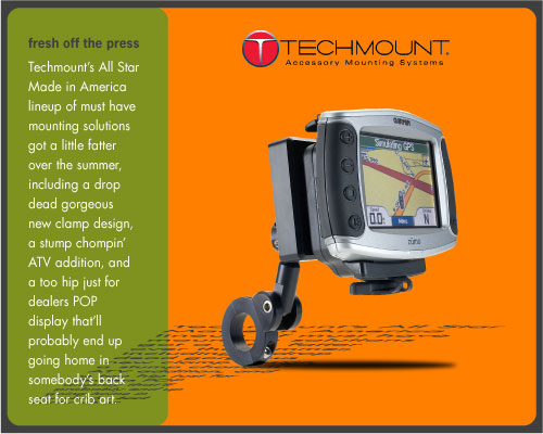 Art for HTML product press release
(click to view)
Art for HTML product press release
(click to view)
Graphic design is a primary investment that associates a brand or product with a unique visual component. Design success is defined by professional appearance, consumer appeal, and technical suitability for use across a broad spectrum of applications, from digital to print to event to specialties.
Lackluster design is a disappointment that sidelines the message before there’s time to read the offer. It gets worse, by making a connection between the unfortunate visual and the brand reputation that can be surprisingly resilient to change down the road.
![]() taking business to market
taking business to market
View more design, brand, and communication solutions in my Béhance and Working Not Working portfolios.


A distinctive logotype is the basis for a successful brand.
Visual brand management starts with a basic type (word mark) and/or graphic (logo) structural element. My approach is to reduce the preliminary concept to its simplest components for primary use in web, print, event, or other projects, before adding degrees of complexity and refinement.
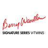 Berry Wardlaw Signature Series word mark built premium brand recognition in a crowded powersports high performance engine market. (Roll over to view mark designed for parent company.)
 For custom builder Choppers Unlimited, the goal was to capture the motorcycle manufacturer’s Nordic heritage. That began with the selection of a medieval Blackletter font, combined with a stark graphic of an abstract bladed weapon, to represent the Viking ancestry of the product.
![]()
After first determining the logotype could stand alone as a one-color minimal element in various sizes, gradient blends were added to define the metallic components of the brand.