


A Crocker, A Paper, And It’s A Wrap
October, 2003 | by John Siebenthaler: photos©john siebenthaler
 (PORT
ORANGE, FL) Back from the 2003 version of Biketoberfest, Daytona's mini-version
of Bike Week is a more relaxed event that usually misses the hotter than
the hinges of hell summer melt down, where hanging out at The Horse/BC's
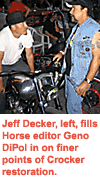
bike show Saturday night put me up close to Utah sculptor and over the
top vintage restorer Jeff Decker and his drop dead interpretation of a
'41 Crocker that's old enough to be his grandfather's ride but looks like
it came straight from art deco central casting.
(PORT
ORANGE, FL) Back from the 2003 version of Biketoberfest, Daytona's mini-version
of Bike Week is a more relaxed event that usually misses the hotter than
the hinges of hell summer melt down, where hanging out at The Horse/BC's
bike show Saturday night put me up close to Utah sculptor and over the
top vintage restorer Jeff Decker and his drop dead interpretation of a
'41 Crocker that's old enough to be his grandfather's ride but looks like
it came straight from art deco central casting.
 Jeff's
an artist, a metal sculptor raised in SoCal on hot rods and Bonneville
speed trials, and a biker, in a time when both labels seem to be applied
rather generously. Skilled not only in fabrication - his work can be seen
at industry venues throughout the country (check
out his Hippodrome Studio website) - but in vision. I especially enjoyed
his down-to-earth explanation of why he feels bronze is superior to silver
when it's time to pour a casting.
Jeff's
an artist, a metal sculptor raised in SoCal on hot rods and Bonneville
speed trials, and a biker, in a time when both labels seem to be applied
rather generously. Skilled not only in fabrication - his work can be seen
at industry venues throughout the country (check
out his Hippodrome Studio website) - but in vision. I especially enjoyed
his down-to-earth explanation of why he feels bronze is superior to silver
when it's time to pour a casting.
While the industry's rampant with technical craftsmen, there are but a small handful - Denny Berg, to name one of the most extraordinary - of real creatives, capable of taking the same old same old two wheels astride an engine and presenting them in a totally new, very economical style.
Take a look at Jeff's hand cast - that's right, cast, via lost wax method - aluminum tanks for starters. Fat bobs, yeah, but with an instinctive organic feel. This fully functional ride began as an engine only vision. Everything else was either repro'd from OE collected or borrowed and then (re)cast by Jeff or fitted (like the Norton tranny) to look authentic, or at least like it belonged.
Expressing balance and function, without looking like a hack job, is what separates talent from tacky. And the easier it looks, generally speaking the tougher it is to accomplish. Jeff chose metal and motorcycles to express his vision. Had his passion been print, his instinctive talent may well have led him to the New York Times instead.
Get in touch: 801.362.6247
www.hippodromestudio.com
(PS) You can see Jeff's unbelieveably detailed life size Joe Petrali piece in front of Corbin's Main Street location in Daytona Beach, and at Bob Dron's HD in Oakland.
"New" New York Times
Unless you follow the print trade, it's reasonably certain the October
20th announcement of a new
style guide for the New York Times headlines went unread at the breakfast
table. Having chosen Cheltenham's Roman and Italic family for the first
comprehensive makeover since the early 1900s, the staid paper of record
reestablishes why they're considered one of the most comfortable to read
formats in print. That's comfortable, as in line length, leading, type
face, and size.
Although not offensive, the differing styles in use for nearly a century began life as hand set metal type, back when a buck was a dollar, and were an obvious anachronism in the computer age of desktop editing and offset printing. Back then, fonts were neither plentiful nor cheap, and there was no such thing as scaling. If you wanted 16 point, you'd better have 16 point. Old skool? It doesn't get any older.
Previous makeovers have included the introduction of four-color art, and the change from an eight to a six column layout. In any event, the story succinctly illustrates how important legibility (typography, for the sake of this discussion) is to readership, and of course comprehension, which leads to commerce. Good typography is an art, and the better at it the designer is, the easier it'll be for him/her to get their message across. If in doubt, read the Times - if not for content then certainly for style.
World's Biggest Paper - Really!
While we're talking newspapers, take a look at what London's Financial
Times came up with as a marketing initiative for their new Asian headquarters
in Hong Kong, as reported by AdAge.
That must have been some brainstorming session...anyone have a problem
with blowing an estimated $6 mil on wrapping a couple of 88-story office
towers in 60,000 square feet of graphics? Good, now how 'bout some Krispy
Kremes.
This is what "thinking outside the box" can lead to. If the marketing goal is to generate publicity that draws a straight line to your product, then this is as good as it gets. Compared to another summer pr gag that involved an illusionist hanging out over the Thames River in a Plexiglas box for a month to hype his, well, we're not quite sure as to the goal, suspended from a crane above a public that used the gimmick as target practice for yesterday's leftovers, this project combined with traditional print and broadcast to hit a marketing home run out of the park, and beyond the harbor.
Ahhh, Excuse Me, But If You've Got A Point, Could You Get To It?
There is a point, actually several, connecting Jeff's Crocker, the Time's
headline makeover, and the FT's multi-million dollar Hong Kong extravaganza.
All accept, take advantage of, and acknowledge, the huge impact visual
design makes in our daily lives. More and more, Americans knowledge of
and demand for design standards is driving marketing decisions that understand
the revenue to be derived solely from design content.
And while the venerable Crocker is the least of the three cited in terms of budget and impact, all are equal in terms of integrity and vision. So whether it's a newspaper headline, a dimensional (motorcycle) object, or a bold display so massive the installation required a team of 18 Japanese mountaineers, the intent is the same. Stop. Look. Understand what I'm saying.
©john siebenthaler 2003