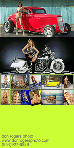
 Don Rogers photo
Match Talent To Job Or Your Brand Will Suffer
by John Siebenthaler
note: Since this column was first written, digital advertising has eclipsed print, decimating the ranks of professional photographers. Still, the need for images with impact has never been greater. Today, using just a basic point and shoot, compelling photos are very much within the realm of possibilities — given a little imagination, inspiration, planning and post production imaging. And if still in doubt? Call a pro.
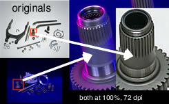
Good photography is the difference between your product looking like it was stamped out of sheet lead between two rocks at a Bangladesh beach party or a carefully constructed machine part ready to go to work.
The comparison above (both shown at the same enlargement and resolution) clearly demonstrates the painful difference between professional and pitiful content. At 200 dpi, the flaws are much worse. Read about low and high res basics here.
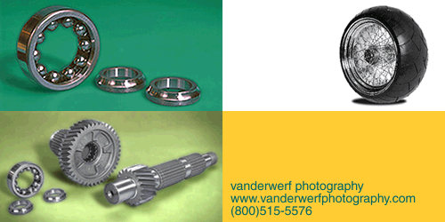
I worked with both images for separate clients on separate projects. (more info: post production digital imaging.) Rod VanderWerf photographed the main gear on the left for me: note the main shaft bearing support detail easily visible in the main gear, as well as the tooth detail on the transmission side.
The other shot was furnished by a client more concerned with price than quality. The inferior image required hours of digital manipulation just to get to the acceptable stage. In the end the product lacks luster and detail – which would you buy?
It’s A Visual Thing When you flip open your latest copy of Easyriders or Cycle World, what’s the first thing you notice? Photography. A nice mix of editorial and advertising, with some new product thrown in for balance. And it’s the quality of that photography that sets publications, and the products therein, apart from their competitors.
Everybody has a nephew, niece, cousin, or girlfriend with a shiny new digital camera and a backpack full of double-As who’s just itching to show you what great photographers they are.
But in an industry that’s built of stainless steel, polished aluminum, chrome plating, and high gloss black paint – the most difficult surfaces to photograph – enthusiasm alone isn’t good enough.
Step into the studio and take a few minutes to see what the view’s like from the other side of the lens.
Apples And Oranges Professional photography’s the difference between screen resolution acceptability and print reproduction necessity. It’s illusion, vision, talent, and way up there at the top of the list, lighting. It’s what decides the all-important bottom line: how many customers are inspired by the photography to linger for the message?
The common impression is that bundled camera and computer software is capable of replicating or replacing professional talent and equipment. While today’s modern equipment is incredibly versatile, it’s not capable of delivering the quality necessary for accurate reproduction in media ranging from web to print to outdoor to display.
For a better understanding of the difference lens talent makes, I talked with Rod VanderWerf, in Waterloo, Iowa, and Don Rogers, in Hollywood, Florida. I’ve worked with both, and their excellent work and easy going attitudes make fulfilling the client’s goal all that much easier.
Don’s solidly identified with the powersports industry, due mainly to his work for such publications as Easyriders and Hot Bike. His portfolio also includes plenty of stock, glamour, and hot rods, which are replacing the travel and leisure industry gigs that took a pounding post 9/11.
Regardless of whether he’s shooting a billet license plate holder or directing a bikini-bottomed model on the finer points of straddling a big twin while wearing six-inch heels, the results are consistently accurate, full of life and devoid of DIY gross errors that require hours of digital correction.
Anybody Got A Light? Rod’s more of a generalist, with a bigger emphasis on family and industrial photography. In the snowblower shot (below) set up in his cove cyc, you can clearly see how the placement of the main and fill lighting provide even illumination, while the key light in back blows out the background for a perfectly white separation.
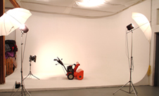
Rod VanderWerf photo A cyclorama is invaluable in any kind of product photography. Wall(s) and floor blend together seamlessly for gentle cast shadows and variable lighting control.
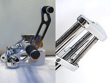
Product shots need more than a bedsheet for a backdrop. The client’s dreadful forward control photo (L) was shot inhouse for catalog use. It’s junk and can’t be salvaged, even with extensive Photoshop surgery. Rod’s sell sheet triple tree detail (R) for the same manufacturer delivers perfect separation of the polished surfaces from the background.
“My biggest challenges are rounded, highly reflective surfaces,” he says. “Stainless is the worst, and I try to keep the reflections in an area where they’re easiest to deal with using Photoshop.” Sound familiar? See the second client-as-photographer example below for a direct comparison of what happens when lighting isn’t respected.
Cycs are an absolute necessity for producing a smooth, professional appearance where walls intersect floors or ceilings. His full cove allows for much larger objects or groups to be photographed without conflicting background shadows and seams, and can handle really long bikes as well as iPods and headlights. And those long Iowa winters are perfect for setting up smaller tabletop shoots, a genre he particularly enjoys.
A recent studio addition is a turntable for producing VR (virtual realty) sequences, which can be especially helpful in presenting multiple facets of a product to a customer who’s viewing is over the internet.
Both Don and Rod enjoy the process of producing top quality product photography. For Rod, it’s the set up as much as the shoot itself. For Don, it’s the lighting, the act of getting the just right balance that allows proper illumination of the subject without creating unnatural shadow conflicts.
Owning A Hammer Doesn’t Make You A Carpenter On that subject, Don’s standard response to clients who question his rates is pretty straightforward. “You’re paying me to light the set, not take the picture,” perfectly expresses the raw advantage of hiring professional photo talent. He doesn’t mention the subjective nature of vision and experience, or the daunting technical knowledge that’s required to consistently achieve exceptional results.
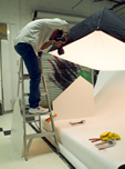

Don Rogers photos
(L) Don positions his soft box strobe head over a small product layout on a sweep setup. Nearly every aspect of commercial and industrial photography revolves around light and shadow.
(R) If you want to look your best, professional makeup is a must, for people and products.
He says that what really sets a professional photographer apart from an amateur is that, “We make it look natural.” And that’s as true for nude centerspreads as it is for parts and accessories. He goes to lengths to point out that, “it’s all about the light.” Lighting seminars are a constant on the educational check off of anyone who aspires to photography as a career.
When he’s not diving with sharks or hanging out of a helicopter shooting golf courses for developers, Don’s setting up centerspreads or thinking about the next themed shot for his glamour collection.
Changes to the travel industry post 9/11 caused a shift in his market, and he’s now concentrating on making maximum use of his hot Florida studio. His biggest challenges have been when he had to cut holes in the walls of abandoned industrial buildings to provide bike access. He was after the grunge tech look, the structures lacked stair or lift facilities, and so it was time to get out the sledge hammers.
Editors, Art Directors Say Thanks With that in mind, here are some general tips on what to consider when you’re faced with coming up with new or updated web, publicity, advertising, or catalog photography:
- Trust the photographer’s judgement. They’ve got a pretty good idea of what works both technically and artistically; their work consists of imagining ahead of time how something’s going to look and it’s seldom to never that a client has the expertise required to offer critical informed opinions based on artistic merit.
- If you’re not familiar with a new photographer, ask to see their portfolio, and then take the time to imagine how your special project might look with that photographer’s style imprinted.
- Editors are much more inclined to consider publicity submissions based on the quality of the photography. Consider calling ahead for specific likes and dislikes, and remember that your poor photography makes their books look bad.
- Context may be just the thing to add interest. Consider hiring a hand model (or using a familiar tool or other reference) to indicate size and scale for small part setups.
- Consider various formats for your shots: having a choice of horizontal, vertical, and square layouts makes editing and the editor’s job much easier.
- For studio shoots, setting the lighting is the biggest factor. Once that’s in place, a large number of similar sized bits and pieces can be run through very economically.
- Learn to look at how lighting falls on the part. Pay attention to highlights and shadows. You see exactly what the camera sees, so learn to interpret the scene.
- If you don’t have an experienced art director who can spell out just what’s needed for that ad or this web banner, leave it up to the photographer, or ask him/her if they can hire freelance talent to help with the chore.
- The same holds true if you aren’t familiar with the photo imaging software that came with that $75 scanner. Getting a set of prints back from WalMart isn’t the same as ftp’ing a file to a publication web site for CMYK reproduction.
- Above all, look for imagination. Even a wet mop on a bathroom floor will benefit from a little glamour.


